Learn to do Appliqué by Hand or Machine

Prepared edge appliqué is a simple way to get great excellent results—with all of the hallmarks of good workmanship. The appliqué shapes should have smooth edges and curves and sharp points. Whether you want to do a classic Baltimore Album style quilt, or something simple for a baby quilt, this video will help you learn. I demonstrate the method for using freezer paper to make your templates (look for Reynold’s brand freezer paper), and then you can choose to sew it in place by hand or machine. Enjoy this free lesson!

Sandra

The pandemic reset our lives

I arrived at the airport in Coffs Harbor NSW Australia at 5:00 am on the morning of March 16, 2020, only to discover my flight to Sydney had been cancelled a couple hours prior.  Rescheduled to an early afternoon flight, I would miss my international flight that day, first to LAX and then home to the Northern California area.

Nothing to do but go back and sleep for a couple more hours, and then back to the airport and to a hotel in Sydney to await the next day. Traveling home in a pandemic was probably one of the moments in my life that was simply terrifying. But, when faced with a situation in which I was both desperate to get home, and yet fearful of a 14 hour flight with coughing passengers— my need to get home prevailed. Actually, getting on the plane was about my only choice.

The next two weeks were agonizing as well. I took my temperature daily, and upon waking would first take stock of my body. Was I well? Did I feel like I was running a fever or had a cough?  By nothing short of a miracle, I was well. I am fine. That has left me feeling so grateful to be alive, and feeling like I must continue to try and do good in the world where I can, and to continue to make art and teach. To thrive.

I lost all of my income this quarter of 2020 for the most part. The cruise to Alaska is cancelled, as well as the other teaching opportunities I count on. But I know I can survive that, and I just need to reconfigure my business model.  The pandemic has reset my life.

I received many requests for online teaching this month. Students who were looking forward to their classes with me are feeling as disappointed as I am.

Thus online workshops are underway! I am planning the curriculum (always a teacher!), with thoughts of bringing you—the student—into my studio via video camera.  It may be yet one of the most rewarding aspects of teaching I have done, just short of sitting down in a chair next to someone trying the technique for the first time, and offering gentle suggestions and lots of praise and encouragement.  Online workshops will begin mid-May 2020. I’ll invite you to work with me, as the weeks progress. I’ll support you via email—in which you can send me a snapshot of your work to get feedback.

Together we can move forward, in the world that the pandemic has shaped for us. For those of us lucky enough to be able to stay home and stay well, this is an opportunity for personal growth.  I hope you are as excited about that as I am.

The picture I have added to this post is a work in progress since arriving home.  It kept me sane, and the peaceful scene of the rocks in the stream, their edges worn smooth by the tumult of the water reminds me that life does in fact stress us all, but by perseverance and strength we can become something beautiful.

Rocks in a Stream, in progress. Derived from a Ken Miracle photo.

Rocks in a Stream, in progress. Derived from a Ken Miracle photo.

Reflections

When I posted pictures of my recent work on Facebook, I was surprised to see the number of people who assumed I posted a picture that was the actual photo that inspired my quilt, and not a picture of the quilt top itself. It was simply so photo realistic, that many people were surprised when I told them, no, that IS the quilt top.

I didn’t start out to do photorealism in fabric.  In fact, I rather surprised myself.  I have been focusing my work recently on the study of how light is reflected off of glass or water.  This has been an area of interest to me since I was a young woman.  I would marvel at the work of artists and painters who could so wonderfully represent and convey the reflection of objects and people in mirrors, or who could show the distortion of light though a glass.  To achieve this in fabric is my goal.

My process is similar to many people who are currently working in raw edge art quilts based on photographs.

The first step is choosing a photo.  Since I don’t consider myself a great photographer, I have used photographs from other people as the starting point.  I always get permission—in writing—prior to beginning the piece.  Without the consent of the photographer, I could not share my work or enter it in shows and competitions.  The work then, is listed as derived from a photograph by (___________).

In the quilt show here, that artist is a man who is local to me, and does serious photography in the area, John Slot.  Next, I get an enlargement done.  I have done this on sites like blockbuster.com, and printed it out myself on 8" x 11” plain paper, and then taped those sheets together to get my picture.  It’s fairly low cost, but not free, exactly, when one considers the cost of ink.

My favorite source was actually Vistaprint.com.  They are fast, the site easy to use, and reasonably priced.  Print the photo in the size you actually want the finished quilt to be, minus any borders you wish to add.

NOTE:  I am not printing the photo itself on fabric.  There are companies who do this service, like Spoonflower.com.  I would use them for other types of quilts, but not this.

Technically, the process goes like this:  I trace every line I see onto a piece, or pieces of freezer paper.  I use a light box for this, and draw on the paper side of the freezer paper.  Buy Reynold’s Freezer Paper!  Keep them in business!

The sections are cut out, ironed onto a piece of fabric, right side up, and a fusible adhesive in ironed to the back ( I prefer Misty fuse).  The piece of fabric is cut out, ironed in place on a backing fabric, and the next piece, usually adjacent, is added next.  Keep doing this until you finish.

It can be a slow process.

But the real magic is choosing the fabric which represents the section you are working on.  I am fortunate to have years of experience in the dye room.  I was able to hand dye large pieces of blue, as you see here, in ways that resulted in both smooth finishes without air bubbles, or pieces that represented textured water, or the sky with its light wisps of clouds.  

I plan to write more about the dye process!  Stay tuned.

Baker Beach, a work in process.  Derived from a photo by John Slot, and used with his permission.

Baker Beach, a work in process.  Derived from a photo by John Slot, and used with his permission.

Design Sources

Just this week I was caught up in a discussion on social media that was pretty, well for lack of a better word—heated.

The discussion centered on a whole cloth quilted wall hanging that won a first place ribbon in a major competition.  The quilt in question was a design taken in its entirety from a artistically drawn coloring book for adults.  

The comments were —at times —pretty scathing for the woman who entered the quilt.  As thecomments rolled in, the quilter in question did answer that she had followed the rules of the show, and had submitted written permission from the coloring book author with her application to the show.  She was a first time entrant in that show as well.

The show rules do require that if you are using a design from another source, you must obtain written permission to enter.  

The permission given probably also allowed the quilter to have a financial win, but I am not aware of any other agreement that they may have had.

So, the show rules allowed this, and the judges were probably aware of it.  The quilt then, in the judges eyes, based on both the quality of the stitching, and with design permission given, ranked well.

Of course, if it hadn’t won anything, no one would be talking about it.

I also believe that if she had used traditionally inspired designs, including quilting stencils, feathers, cross hatching and the like, no one would have blinked an eye. 

As someone who has used photographs taken by both professional and amateur photographers as source material, my head reeled with the implications.

When I was at Houston last year, I attended a lecture by David Taylor, a quilter and competition winner who uses photos for his subjects.  He started the lecture by telling us that he also was aware of talk on social media concerning a similar issue with a winning quilt in Houston 2016 "World of Beauty" competition that was based on the work of another artist.  The quilt was quoted as “an original interpretation” of a work from that artist.  He defended the win.

As you can imagine, people were very critical of the fact that the quilt maker won a large prize based on art from another source.  Is it fair?

Is it fair?  

You can see their point.  Original design is hard.  It is why artists are seen as something special—which they are.  Comments were made that interpreting someone else’s art is just craft.  Ouch.

In the end, the social media poster who questioned this win felt that if you are using another person’s work as your design source, you should be in a different competition category than those with original design. 

There is a good reason to feel that way—design is hard and original designs should score higher points in judging than non-original design. Do they need there own category?  I'm not sure.

There is somewhat of a precedence for this argument.   Not only in the disclosure, but In the IQA rules, quilts --quilted by another person-- have to be entered in the two person category.  Furthermore, you cannot have paid that person to quilt that quilt.  

But in using another’s design, that second person never actually works on the quilt. 

Additionally quilting comes from a tradition of shared patterns and designs.  As someone who has made several Baltimore Album style quilts, I have used patterns drawn more than 100 years ago.  I was always very proud of my work.

I also pointed out that some of those patterns actually were derived from Theorem style paintings from the 1830’s before they were ever quilt blocks in the 1850’s.

So quilting has that history.  If we eliminate all patterns from the quilting world, what would be left?  

I would even argue that if you are a whole cloth quilter who is using the feather design in your work at all, you are borrowing designs from the person who first drew them— an anonymous woman or man from a different era.

Another woman commented on social media that we were making her feel bad.  Why?  I asked.  She replied, because I am not an artist myself, and I can only use designs created by others.  She felt somehow less.  I assured her that design is a learning process.  WE CAN ALL design, it just takes practice, and more practice.

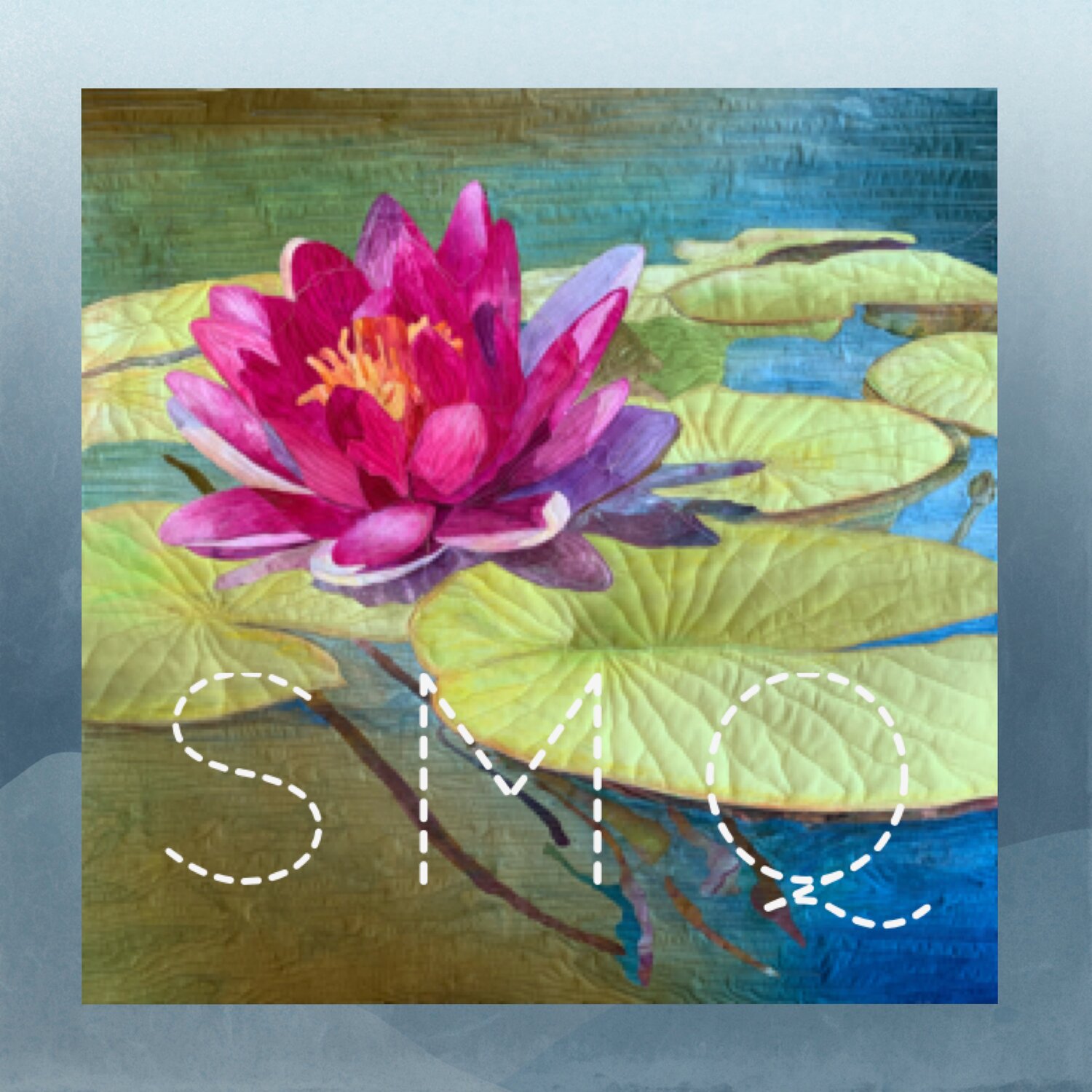
Here is some recent work.  Like any mother these days who wants a picture of one of their kids, I lifted a selfie of my daughter Liz from her Facebook page.  I processed the photo into a posterization app on my iPad, printed it out, and used that as a pattern to make this quilted portrait (which even her 4 year old daughter recognizes as mama).  I don’t plan to give my daughter design credit for her selfie—sorry Liz!  But I will disclose the source of the photo

Does that make me less of an artist? 

Liz

Battles with Batting

I'm almost tempted to not write this blog, as the photo I am attaching is less than flattering for my work.  Nevertheless, it must be said.  Batting makes a difference.

I shipped two quilts to PIQF last week, one of which (Flourish) took a ribbon for "Best Use of Color."  It hung neatly at the show, without a single wrinkle.  In the photo below, you can clearly see several very deep creases in this work (Reflections of Liberty Station).

What happened?  Well, both pieces were shipped in the same box.  They were neatly rolled around a piece of tissue paper, not folded.   Both hung flat and square at my home prior to shipping.   The only thing I could think of was that once unboxed, they were placed in a pile of other quilts, and severely compressed as they were handled by the staff of Mancuso Bros.  

Flourish, my butterfly, survived the rough treatment without a bit of problem.  This quilt, however, looked simply terrible.

Both quilts were made more or less the same way.  Both are cotton.  The batting, however, was very different.  I used Tuscany Silk Batting by Hobbs in Flourish. In  Reflections, however, I used Hobbs Heirloom Fusible Cotton Batting.  I did like the fact that I didn't have to baste.  I ironed the top and backing to the quilt and proceeded to spend many (!) hours sewing it.

Both were quilted more or less equally.  Reflections was also, in full disclosure, built on a piece of white muslin, and Flourish a hand dyed cotton fabric.

I have recommended this batting, but won't in the future.  The wrinkles in this piece can be ironed out, but because I cannot control what happens to it once shipped to a quilt show, I would rather use a product that can live up to the hype.  I am all in to the Silk batting now.  Really.


Starting a new chapter

I have spent 25 years making traditional quilts.  I love those pieces, and like most people who create, you can look back and see the evolution of your tastes, and a general improvement in technique.

When art quilts first started appearing in shows and publications, I looked at many of those pieces and admired them, but didn't have the technical skill set to make them.  Art quilts are both  a personal statement of vision paired with a technique used to express them.

As my 'toolbox' of skills has grown, my ability  to express my own voice is likewise growing.  Below is a close up photo of my quilt "Flourish."  This piece was photo based, and I would like to thank Mattie Bryant, who generously allowed me to interpret her image in fabric.  It is enhanced with textile paint in places, and is raw edge fused.